
A well-formatted spreadsheet shows the meaning of its data clearly and concisely. With the techniques we discuss in this tutorial, your spreadsheet will be easier to read, bringing attention to the parts that matter most.
Default Formatting
All spreadsheets apply default formatting depending on the type of data in each cell.

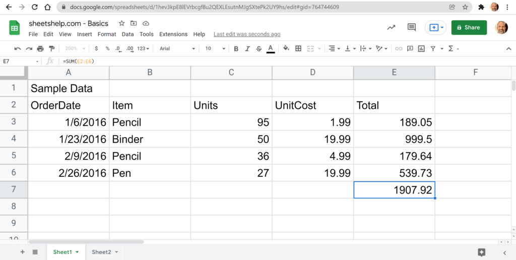
The four cells outlined in red are unformatted.
- Text values align to the left
- Numbers align to the right
- Errors middle align
- Boolean value middle align
For a small spreadsheet, you don’t need to change the formatting. But, even in the example above, the center alignment and bottom border for the header row let the user know the first row is not part of the data table below.
Video Tutorial

Basic Table Formatting
The table in the image below is the table we are starting with. Get your copy of this spreadsheet to follow along.
💡Google Sheets can automate table formatting for you. This offers more control over the data structure but can be unnecessary complexity if your table is small.
Make Your Title Stand Out
First, let’s show that the title of Sample Data applies to the whole table. We can do this by making the text larger and centering it among all the columns.
As shown in the animation, you can format the title with these steps.
- Select the cells you want to merge,
A1:E1in this example.- Click the Merge cells button on the toolbar.
- Click on the Horizontal align drop-down and choose Center.
- Choose Font size and change the value to 14.
- Finally, click on Bold to make the font heavier.
Style the Table
Now let’s move on to data in rows 2 through 7. The header in row 2 and the footer in row 7 do not stand out from the rest of the data. To fix this, let’s start with the built-in tools that Google Sheets gives us to make this task easy.
Alternating Colors
Now we have a table with the header, body, and footer clearly indicated. This image explains that the header is the row above the data, the body is the data, and the footer contains additional information such as, in this case, a total.

Header Alignment and Border
Let’s make a few more improvements to the header row. The dark green color applied in the previous step helps to accentuate the headers. However, the column labels will look better if we center them and use a bottom border.

Both the cell borders and alignment options lead to drop-downs with more choices. Choose Bottom border and Center alignment.

Notice the black border under row 2. This border creates a visual separation between the data’s header and the body. The center alignment of the labels in row 2 makes them look more prominent than the body below. Now we’ll style the table’s footer.
Start by selecting the footer row. Selecting the footer row allows us to change the cell borders between rows 6 and 7 and the font weight in row 7 without reselecting cells.

We’re almost done with our table.
Currency Number Type
Now we will apply some formatting that shows the numbers in columns D and E are currency. You can use the menus to get this done.

Go to Format, then Number, then choose Currency. The currency format will put a $ sign (or your local currency) before the number.
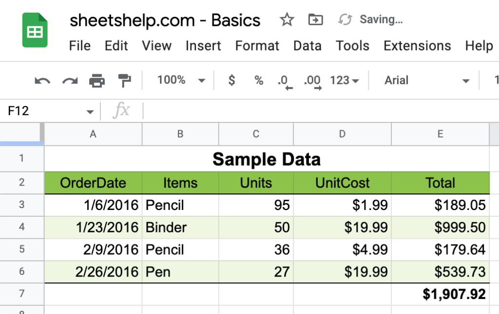
Now your data is easier to read. It lets the reader know where the table starts and ends, the location of the header and footer, and that the last two columns are currency.