
Sparklines are miniature charts that you can embed within cells in Google Sheets. They are a great way to visualize data trends and patterns and can also be used to rank numbers.
We’ll be adding sparklines to visualize the differences in the tuition of five colleges. The sparkles clearly show the detail in their relative prices by their difference in size.

This tutorial will show you how to create these charts. Let’s start by making one sparkling for the first amount.
Contents
Insert a Basic Bar Chart Sparkline
We’ll insert a sparkline in row 2 to begin. Select cell C2 and enter the following formula:
=SPARKLINE(B2,{"charttype","bar"})
Where B2 is the number that you want to illustrate.

This formula will create a Sparkline that shows the rank of the $37,846 compared to itself. Since there is only one number in the range, the bar is at 100%. Next, we will insert a bar for every school and make the lengths relative.
Use Multiple Bar Charts
The next four sparklines will be scaled so that the smallest number is the shortest bar and the largest number is the longest bar.
Now, we will add the max option to set the maximum length of the bars. We will nest the MAX function inside the max attribute, which chooses the largest amount as the maximum line length. Note that lowercase max is an option specific to sparklines, while uppercase MAX is a function you can use anywhere in Google Sheets. The new formula is as follows.
=SPARKLINE(B2,{"charttype","bar";"max",MAX(B$2:B)})
We will copy this formula down through row 6. The row number for B2 will increase by one for each row (e.g., B3, B4), while the range B$2:B will not since the $ makes it a fixed reference. This new formula creates the following sparklines.
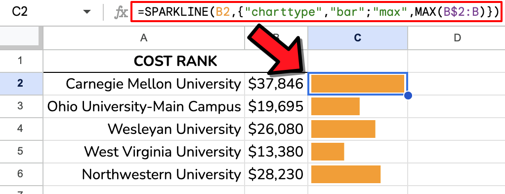
The sparklines show that Carnegie Mellon University is the most expensive school of the five, while West Virginia University is the most affordable.
You can customize the appearance of sparklines by adding additional options in the sparkline formula. For example, you can change the chart type and the line color.
Sparkline Options
The following table shows a list of some of the most common Sparkline options:
| Option | Description |
|---|---|
charttype | Specifies the type of chart to plot. Valid values include line, bar, column, and winloss. |
color1 | Specifies the color of the first bar in the chart. (We won’t be using color2 in this tutorial.) |
max | Highest value on the x-axis |
empty | Specifies how to treat empty cells in the data range. Valid values include zero and ignore. |
nan | Specifies how to treat cells with non-numeric data in the data range. Valid values include convert and ignore. |
Adding Color to Your Sparklines
You can make one bar stand out by conditionally changing its color. For example, our Collge Compare add-on uses colored bar charts to show statistics for your chosen colleges. You can emphasize one college at a time and change the college using the drop-down list in B2:C2.

In order to accomplish this conditional color changing, you must embed an IF statement inside the color option of the SPARKLINE function as follows:
=SPARKLINE(F5,{"charttype","bar";"max",max(F$5:F);"color1", IF(E5=B$2,"red","blue")})
The addition of the IF statement changes the bar’s color from blue to red if the college name matches the name chosen in the drop-down menu.
YouTube Tutorial
See this YouTube video to watch a demo based on these examples.

Template
Install the College Compare add-on to see the colored sparklines in action and copy the formulas for your own use.
Related Posts
Prolific Oaktree describes sparklines overall and bar charts specifically.
Sheetshelp SPARKLINE function page.
Conclusion
Sparklines are a versatile tool for ranking numbers in Google Sheets. Sparklines let you quickly and easily identify a data set’s highest and lowest values. You can also customize sparklines to meet your specific needs.