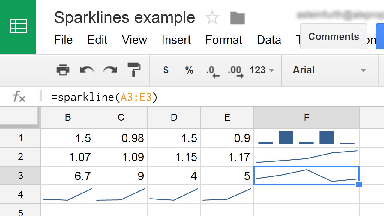
The SPARKLINE function lets a spreadsheet user embed a miniature chart into a cell. Sparklines are similar to regular charts but much simpler to use. Sparklines can be in the form of bar charts, column, and win-loss, or line graphs.

Syntax
=SPARKLINE(data,[options])
data– The range of cells or array of data from which to make the sparkline.[options]– Optional specifications to customize the chart. There are many options.
Video Explanation
Examples
As shown in the image below, sparklines can produce a visual for one row at a time. While this data would be noisy in a full chart, sparklines allow you to see each row clearly without other distracting data.

The first chart is a line chart that can help show trends. The bar chart shows the proportion of amounts relative to a whole. Column charts can show individual numbers’ values, and a win-loss chart shows whether each value is positive or negative.
Live Examples in Sheets
Go to this spreadsheet for more examples you can study and use anywhere.
